
Usability Audit – Census 2024
Heuristic evaluation and usability audit of the Census 2024 website, including web analysis, usability testing and the SUS scale.
 Marie Garrido
- Role
- UX/UI Designer
- Client
- National Statistics Institute (INE), Government of Chile
- Scope
- Heuristic evaluation of the Census website using Nielsen's 10 heuristics (30 rules), the SUS scale and open-ended questionnaires
- Outcome
- SUS of 75 on desktop and 85 on mobile, and 6 final recommendations

Results at a glance
About the Census
The census in Chile is a count of all the people, households and homes in the country carried out by the National Statistics Institute (INE).
Its main goal is to collect data to know how many we are, how we live and how we are distributed geographically, information used to update sociodemographic data, plan public policy, distribute resources and design development programs.
It is carried out through in-person interviews.
The INE is the body in charge of running it; it carried out the last census in 2017, which counted a population of 17,574,003 people.
Project context
In 2023, the National Statistics Institute (INE) commissioned a usability evaluation of the official Chile Census website, aiming to detect opportunities to improve the user experience and produce actionable recommendations to optimize navigation, clarity of information and content accessibility.
The site played a key role in the national operation: informing citizens about the 2023 Pre-census, a preparatory stage of the 2024 Population and Housing Census.
During this period, the INE deployed field teams to record homes, addresses and number of residents in 72 communes across 11 regions of the country.
The evaluation covered the whole site, including informational sections, forms, contact channels and census-taker identity verifiers, components essential to strengthening public trust, transparency and access to official information.
The study combined a heuristic evaluation based on Nielsen's 10 principles, using a percentage weighting system developed by the UX team, with the SUS (System Usability Scale) and open-ended questions to complement the quantitative analysis with qualitative perceptions.
What is a heuristic evaluation?
This evaluation applied Jakob Nielsen's 10 usability heuristics, a framework widely used in UX research to detect usability problems from an expert perspective.
These heuristics aren't rigid rules but design principles that make it possible to evaluate effectiveness, efficiency and user satisfaction when interacting with an interface.
Failing these rules means there is a usability problem, helping to identify directly the source of an issue.
Nielsen's 10 heuristics
1. Visibility of system status
The system should always keep users informed about what is going on.
2. Match between system and the real world
The system should speak in concepts familiar to the user, making information appear in a natural and logical order.
3. User control and freedom
Users should be able to navigate freely, easily finding exits and alternative routes.
4. Consistency and standards
Users shouldn't have to wonder whether different words, situations or actions mean the same thing. A standard should be followed.
5. Error prevention
Users should be helped not to make mistakes, for example by adding a confirmation option before they commit to an action.
6. Recognition rather than recall
Minimize the user's memory load by making objects, actions and options visible.
7. Flexibility and efficiency of use
The interaction experience should work for expert users as well as for users with no experience.
8. Aesthetic and minimalist design
It shouldn't contain information that is irrelevant or rarely used.
9. Communicate errors clearly
Error messages should be recognizable and expressed in plain language, indicate the problem precisely and suggest a solution constructively.
10. Help and documentation
Sometimes users will need help and documentation. It must be easy to find and focused on concrete tasks.
Heuristic evaluation scoring system
To evaluate compliance with each heuristic, a scoring system was set up based on three usability rules associated with each Nielsen principle.
Each rule could be met fully or partially, producing a final adherence percentage that made it possible to quantify the level of compliance and compare heuristics.
| Values | Compliance |
|---|---|
| 75 - 100% | Compliance with 3 usability rules |
| 50% - 74% | Compliance with 2 usability rules |
| 25% - 49% | Compliance with 1 usability rule |
| 24 - 0% | Compliance with 0 usability rules |
1. Visibility of system status
The system should always keep users informed about what is going on.
1.1 Is the user aware of their current position within the website journey?
Breadcrumbs. Breadcrumbs let users identify their location within the site structure and easily navigate to higher levels. They usually appear as a hierarchical sequence of links at the top of the page, right below the main navigation.
In the case evaluated, although the component is present, its type size is smaller than recommended for comfortable reading across devices. Good practice suggests a base font between 14 and 16 pixels, which ensures adequate legibility on screens of different resolutions. The site currently uses 13 pixels, which could affect the visibility and accessibility of the element.
Progress markers (flow indicators). The site includes page markers at the top that let users identify their position within a process or sequence of steps. This is especially useful in flows with multiple pages or stages, since it provides clear visual references about progress and remaining sections, improving orientation and the sense of control while browsing.
1.2 Is the user notified of changes in their journey through the site?
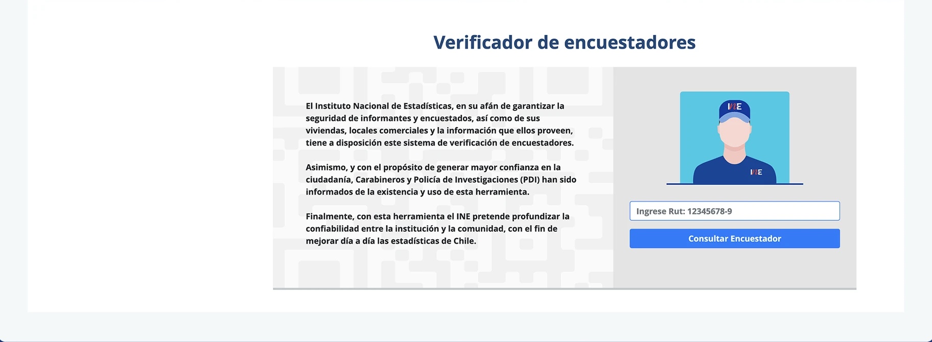
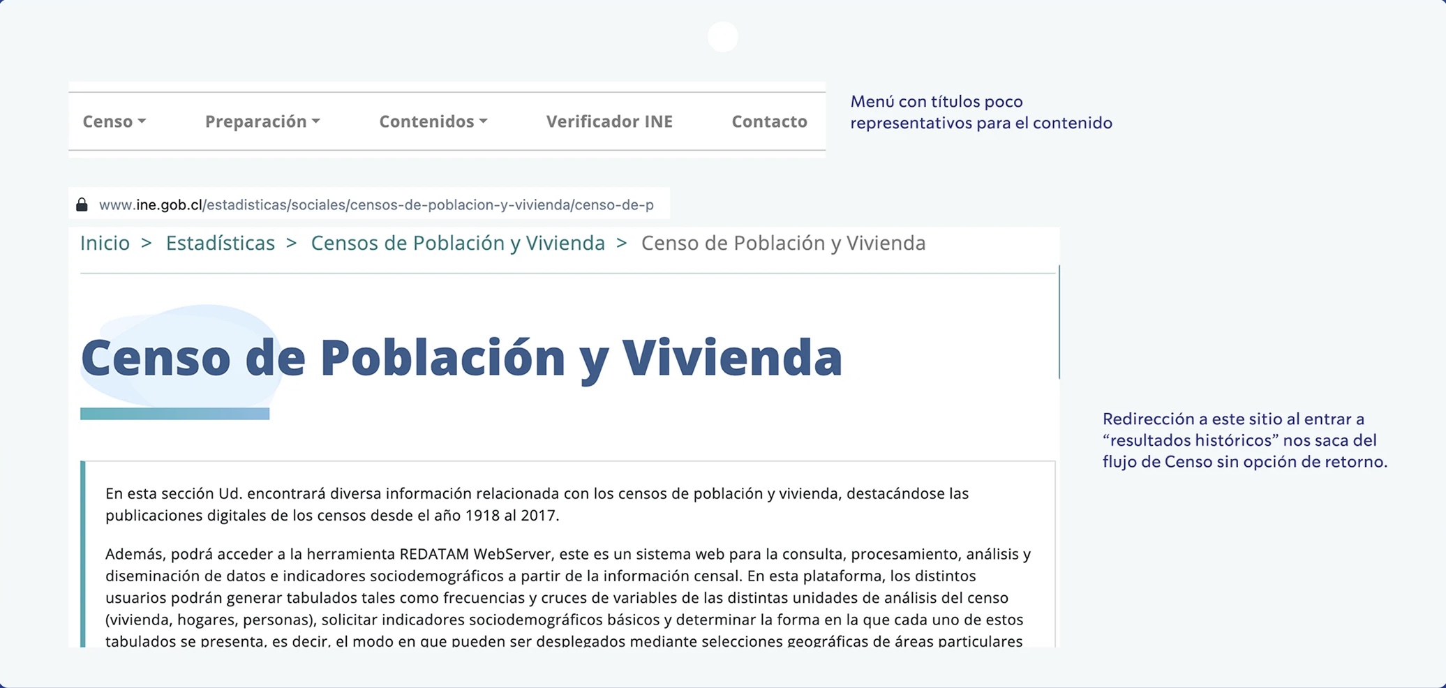
Lack of feedback on redirects. The site shows no pop-up notifications or real-time messages informing the user about a redirect to an external site, as happens when accessing the "Interviewer verifier".
Once inside this section there is no clear route back to the main Census site: the navigation menu disappears and the INE logo isn't interactive, which breaks the continuity of the flow and can cause disorientation or loss of context.
1.3 Is the user aware of the factors that can significantly impact their experience?
Site transparency and communication. For users to understand the factors that can affect their experience, the site must keep clear communication and a transparent design that anticipates behaviors, load times or redirects.
In this evaluation, the site shows more factors against than in favor, which negatively impacts the user's trust and sense of control while browsing.
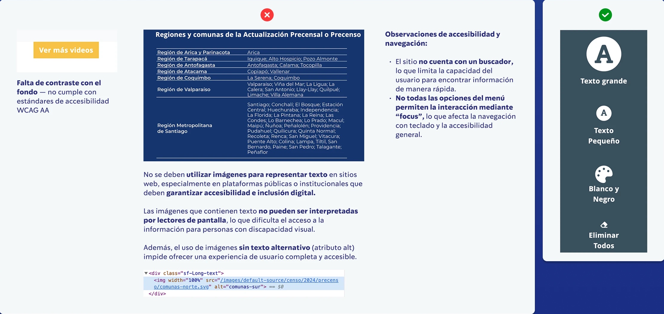
Accessibility and navigation observations: the site has no search function, which limits the user's ability to find information quickly.
Not all menu options support interaction through "focus", which affects keyboard navigation and general accessibility.
Images should not be used to represent text on websites, especially on public or institutional platforms that must guarantee accessibility and digital inclusion. Images containing text can't be interpreted by screen readers, which makes access to information harder for people with visual disabilities.
In addition, using images without alternative text (the alt attribute) prevents a complete, accessible user experience.


2. Match between system and the real world
The system should speak in concepts familiar to the user, making information appear in a natural and logical order.
2.1 Are interface elements and interaction cues easily recognizable?
Not all interface elements are recognizable or behave consistently.
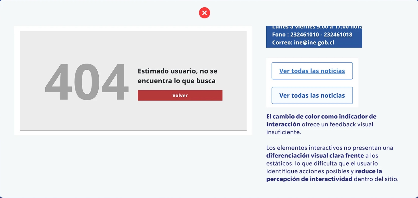
Some buttons give no response when clicked, which confuses users about their functionality.
Likewise, phone numbers aren't interactive and there are sudden changes in the navigation menu, which affects the consistency and predictability of the site.
Color change as an interaction indicator provides insufficient visual feedback. Interactive elements aren't clearly differentiated from static ones, which makes it harder for users to identify possible actions and reduces the perception of interactivity within the site.
2.2 Does the online experience replicate the familiarity of offline actions and behaviors?
The interface is aligned with users' mental model, replicating how they expect the site review process to work based on their experience and real-world knowledge.
This makes the available actions easier to understand and reduces cognitive load during interaction.
2.3 Does the site use acronyms, technical terms or jargon that need explanation? If it uses acronyms, does it explain them clearly?
The site uses clear, accessible language for users.
It avoids technicalities, jargon and anglicisms when describing actions, favoring direct, friendly communication that improves understanding and builds trust in the interaction.
3. User control and freedom
Users should be able to navigate freely, easily finding exits and alternative routes.
3.1 Can the user exit all states, such as pop-ups and multimedia?
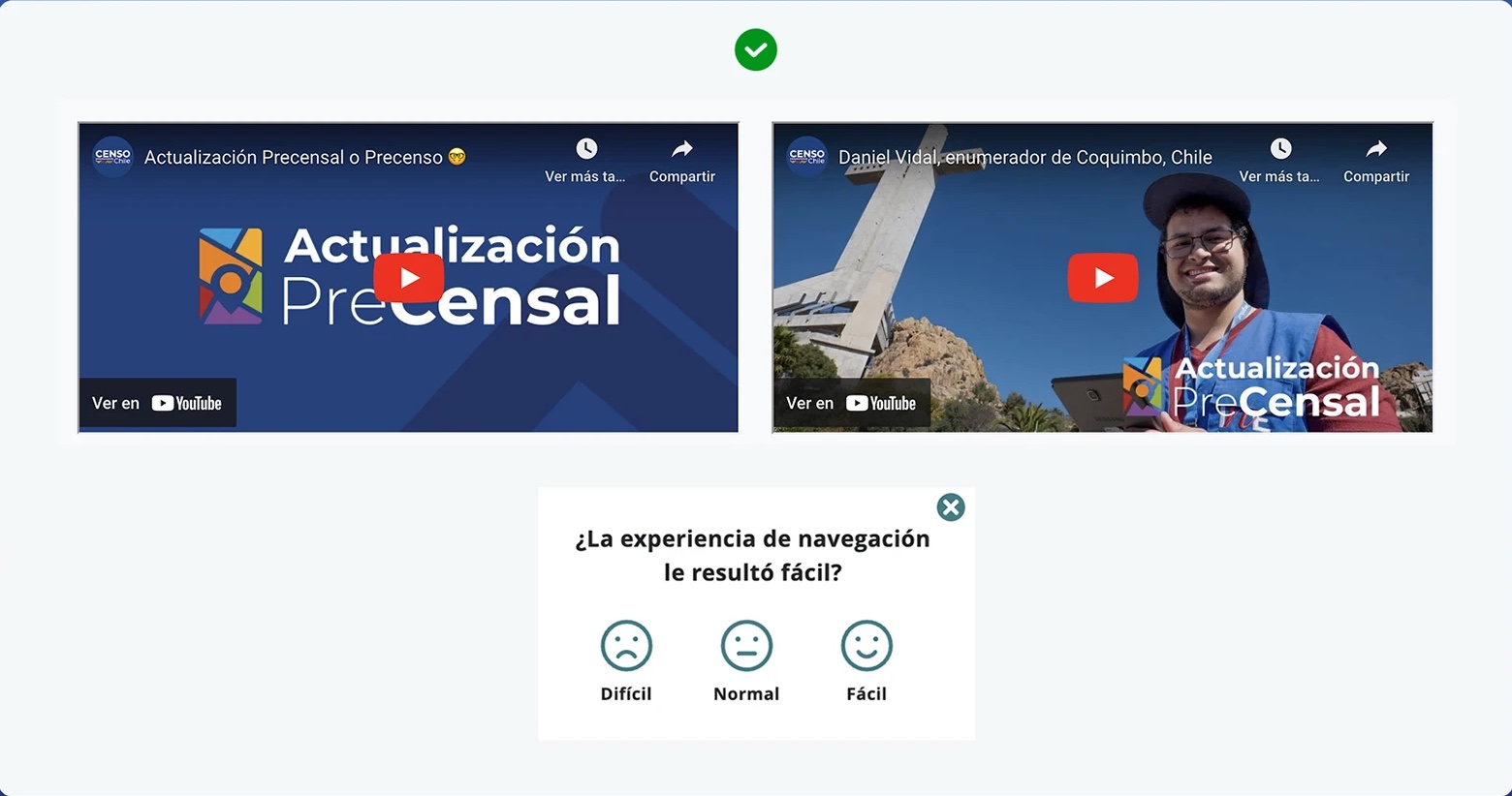
Although pop-ups are few, they work correctly.
Videos play within the same site through embedded YouTube links, avoiding external redirects and keeping the user experience continuous.
3.2 Can the user use the main sections of the website without registering?
Yes, the site doesn't ask for registration.
3.3 Does the user have control over their personal information?
The site doesn't ask for personal information or require creating a user profile.
Therefore there are no instances where the user must manage or edit personal data, which removes the need for specific controls over this information.
4. Consistency and standards
Users shouldn't have to wonder whether different words, situations or actions mean the same thing. A standard should be followed.
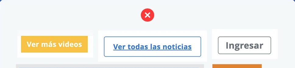
4.1 Is there a consistent design standard for all calls to action (CTAs) on the site?
No.
The site shows variations in the design of calls to action (CTAs), even though they are fundamental elements for guiding users toward specific goals, such as reading content, completing a form or downloading a file.
The lack of visual consistency in these components reduces the clarity of the user journey and weakens brand coherence and the site's visual identity.
4.2 Is there a coherent design standard for form controls?
The site contains no forms.
4.3 Is there a consistent design standard for headers?
No.
The header doesn't keep a consistent design across all sections of the site. On some internal pages (such as News and Verifier) it disappears or changes structure, which makes navigation harder and breaks the continuity of the user experience.

5. Error prevention
Users should be helped not to make mistakes, for example by adding a confirmation option before they commit to an action.
5.1 Are there useful constraints that keep the user from making the same mistakes?
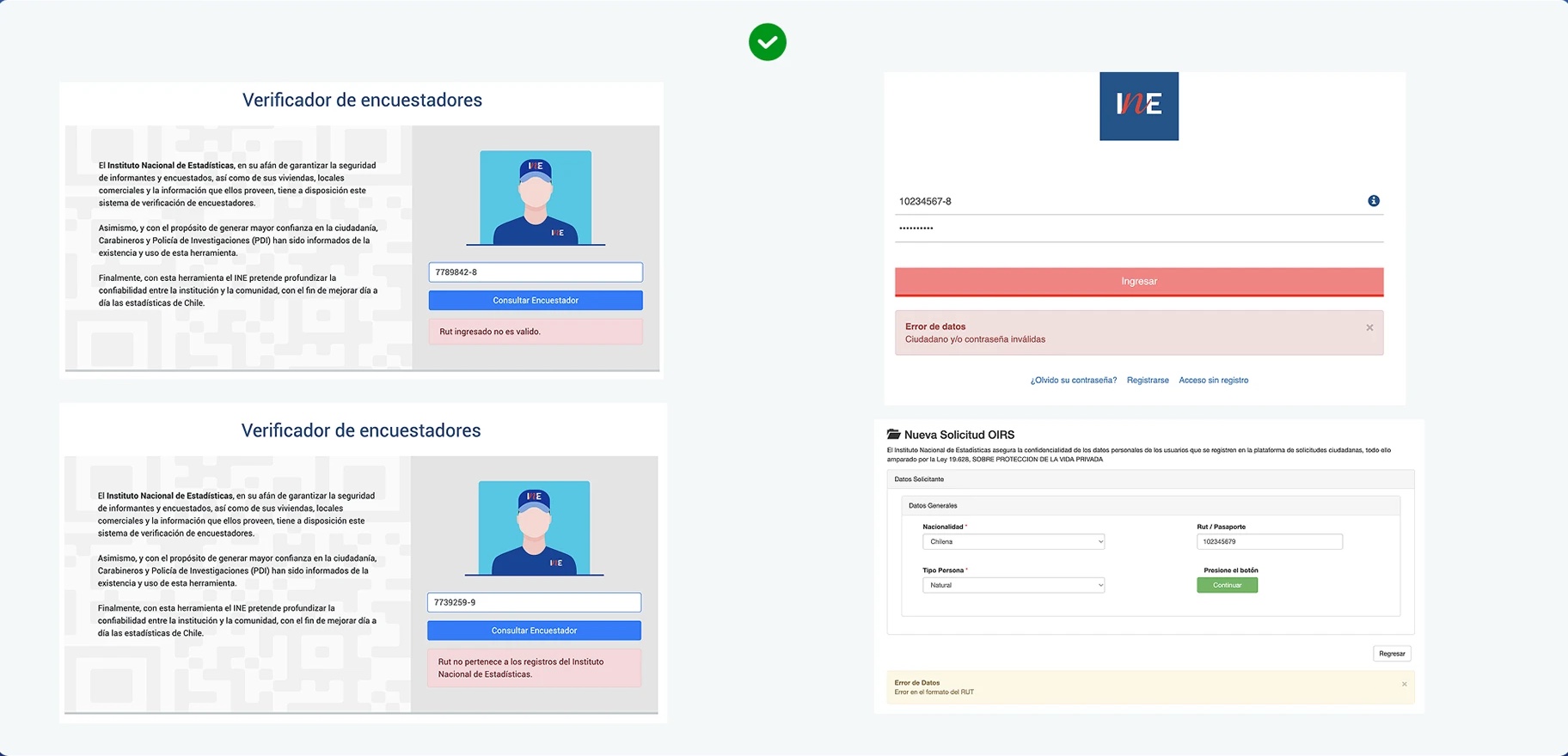
The site shows appropriate warnings for erroneous data entry or when an existing user signs up, in sections that require sensitive information such as the Interviewer verifier.
These validations strengthen user trust, reduce the abandonment rate and improve the accuracy of the data entered.
5.2 Does the user guidance include suggestions to avoid incorrect actions?
Although the Census mini-site flow has no interfaces that lead to errors, the main INE site (which it links to) provides clear, friendly messages and suggestions, guiding the user and preventing incorrect actions while browsing.
5.3 Is the user given a forgiving format for information?
The site has no forms of its own, and those linked from the INE site are simple and quick to complete.
Once submitted, they give immediate access to the requested information without requiring email confirmation, which speeds up the flow and reduces friction.
6. Recognition rather than recall
Minimize the user's memory load by making objects, actions and options visible.
6.1 Is the user shown a list of recently viewed products or pages?
There isn't one.
The website doesn't need it.
6.2 Is the user shown personalized content based on previous actions?
No.
The site shows no personalized content based on the user's previous actions, which is appropriate given that it is mainly an informational site focused on sharing data and general guidance.
6.3 Is the user shown navigation elements that reduce cognitive load and aid recall?
Yes.
The site keeps a coherent, easy-to-understand structure, which makes navigating between categories easier and helps users keep a clear sense of where they are within the site.


7. Flexibility and efficiency of use
The interaction experience should work for expert users as well as for users with no experience.
7.1 Does the user get shortcuts to reach final goals?
No.
The site offers no shortcuts or tools that give direct access to specific goals, such as a search function or quick links.
However, it has a single notable interactive feature: the INE Verifier, which lets users check whether an interviewer's RUT (national ID number) is officially authorized.
7.2 Can the user customize frequent actions?
No.
The site doesn't allow customizing frequent actions, which is consistent with its informational nature, since it has no interactive flows or repetitive tasks that require customization.
7.3 Does the user get contextual information for quick actions?
No.
The INE Verification function offers no prior contextual information guiding the user about its purpose or use.
In addition, the language used isn't clear or friendly enough, and the tool is shown next to other site elements it has no relation to, which makes its main function harder to understand.
8. Aesthetic and minimalist design
It shouldn't contain information that is irrelevant or rarely used.
8.1 Is the user interface design simple and easy to understand?
Although the site design fulfils its function, there are opportunities for improvement in both the visual aspect and the information architecture.
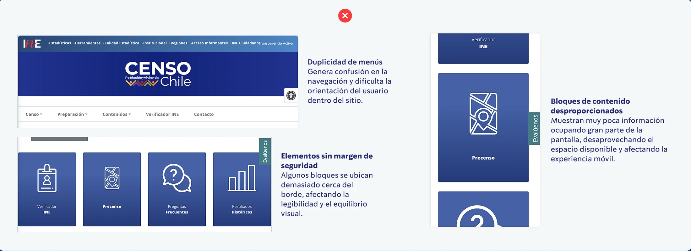
Currently, having two navigation menus creates confusion and makes orientation harder. It is recommended to keep a single main header with the INE logo linking to the home page, reducing visual noise and making content easier to explore.
Likewise, the site structure could be reorganized into five main sections, optimizing information hierarchy and clarity: (1) Information for the general public (Census and FAQ); (2) Pre-census (currently titled "Preparación"); (3) Information for census takers (FAQ); (4) Contents; (5) Contact.
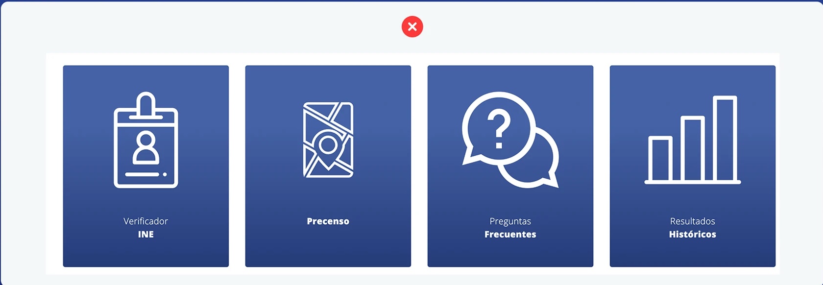
Visually, it would be ideal to rework the size and proportion of the content blocks. Although the desktop version keeps a functional layout, at smaller resolutions margins and padding are lost, producing an inefficient mobile view: whole blocks with just an icon and a title fill the entire screen.
This represents a significant loss of useful space and makes visual scanning harder, which is the main way users navigate and process information on websites.
Findings marked in the image: duplicated menus (create confusion in navigation and make it harder for users to orient themselves within the site); disproportionate content blocks (show very little information per screen, wasting available space and hurting the mobile experience); elements without a safety margin (some blocks sit too close to the edge, affecting legibility and visual balance).
8.2 Is the meaning of all icons clear to the user, and why they are included in the design?
The problem isn't the iconography but the language used to name the sections. For example, the term "Preparación" (Preparation) could be read as a guide for people to prepare for the census, when it actually refers to the preliminary work done by the institution. This lack of clarity can create confusion in understanding the content.
At the design level, much of the site is structured around four blocks that repeat information already available in the main menu. This space could be used better by highlighting, in clearer and friendlier language, the site's most relevant feature: the INE Verifier, an essential tool for guaranteeing the safety of people being surveyed.
In addition, one of the cards in the carousel (Historical results) redirects the user outside the main flow of the site, taking them to a page with no direct return to the original navigation, which interrupts the experience and disorients the user.
8.3 Are all forms easy to understand and easy to complete?
The only form available is the Interviewer verifier, which has a single field to fill in. However, its behavior is inconsistent: depending on the access point, it may open within the site flow or in a new window. It is also perceived as external to the interface, since it has no navigation menu and offers no clear way back to the main site (breadcrumb or return link).


9. Communicate errors clearly
Error messages should be recognizable and expressed in plain language, indicate the problem precisely and suggest a solution constructively.
9.1 Does the user receive error messages when entering incorrect information in a form control?
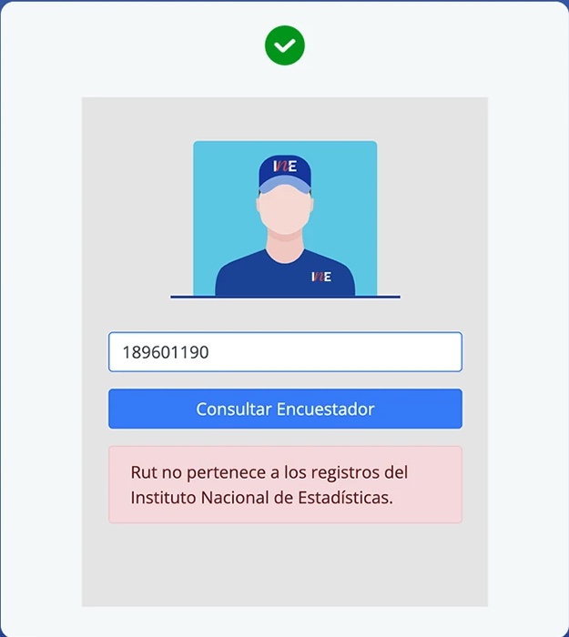
The user receives a clear message when entering an invalid RUT, notifying them that it doesn't correspond to a registered interviewer.
9.2 Does the user get legible error messages that offer useful information on how to fix the problem?
The user gets no message indicating how to proceed if the interviewer's RUT isn't registered in the INE database, which creates uncertainty and a possible interruption of the task.
9.3 Does the user get courteous error messages that don't blame them for the error?
Not applicable.
10. Help and documentation
Sometimes users will need help and documentation. It must be easy to find and focused on concrete tasks.
10.1 Is the user given clear steps/guidelines for using the product's service?
Considering that the website's main goal is to inform about the Census 2024 process, we can conclude this heuristic isn't met. First, the site has no search function, which limits the user's ability to find specific information. In addition, much of the home page is made up of icons, links and videos that give no clear guidance on how to reach relevant content.
At first glance, the hero banner is the element that offers the most information. However, it has design and usability problems: the buttons don't keep a standardized position and the carousel indicator (div) partially overlaps the clickable areas, hindering interaction and confusing users.
10.2 Does the user have access to documentation on relevant topics to help achieve their goal?
The site does provide access to the documentation the user needs.
10.3 Does the user get courteous error messages that don't blame them for the error?
Icons and links to the INE's social networks are shown; however, they don't open in a new tab, which forces users to leave the Census site flow. Although a slight color change and underline appear on hover, it would be advisable to use each brand's characteristic color to reinforce the perception that these are active buttons.
The site also provides contact information, including a phone number, email, opening hours and an external link for citizen support.
Heuristic results
| Evaluation criterion | Score | Percentage |
|---|---|---|
| 1 Visibility of system status | 1/3 | 25 - 49% |
| 2 Match between system and the real world | 2/3 | 50 - 74% |
| 3 User control and freedom | 3/3 | 75 - 100% |
| 4 Consistency and standards | 2/3 | 50 - 74% |
| 5 Error prevention | 3/3 | 75 - 100% |
| 6 Recognition rather than recall | 3/3 | 75 - 100% |
| 7 Flexibility and efficiency of use | 1/3 | 25 - 49% |
| 8 Aesthetic and minimalist design | 1/3 | 25 - 49% |
| 9 Communicate errors clearly | 2/3 | 50 - 74% |
| 10 Help and documentation | 2/3 | 50 - 74% |
General conclusion
The site has no critical usability failures, but it does show four low-urgency findings and three medium-urgency findings that affect the user experience. Overall, the heuristic reaches 30% compliance, which indicates Deficient / Low usability at both the visual design and information structure levels.
Main findings
- Lack of clear, timely feedback: The site doesn't effectively communicate system states, such as error messages, loading indicators or action confirmations, which creates uncertainty and reduces user trust.
- Accessibility and control shortcomings: The interface offers no shortcuts or functions that make navigation easier, such as search or quick actions, limiting efficiency for both new and experienced users.
- Visual and architecture problems: The design shows information overload and weak visual hierarchy, which gives a sense of disorder. In addition, the lack of consistency in styles and components affects the overall coherence of the site.
- Limited adaptability: The site doesn't adjust correctly to different devices or resolutions, creating an inconsistent experience across platforms.
In short, the site fulfils its basic informational function, but it needs improvements in visual consistency, navigation structure and communication with the user to achieve a smoother, more modern and more trustworthy experience.
Results interpretation scale
| % compliance | Usability level | Description |
|---|---|---|
| 0% - 20% | Critical / Very low | The site has serious usability problems. It hinders navigation, comprehension and completion of basic tasks. Urgent redesign required. |
| 21% - 40% | Deficient / Low | Multiple frictions are seen in the experience. Problems affect user efficiency and comprehension. Significant improvements needed. |
| 41% - 60% | Acceptable / Medium | The site partially meets the heuristics. Navigation is possible, but with points of confusion or cognitive overload. Optimization recommended. |
| 61% - 80% | Good / High | Mostly meets good practices. Smooth experience with minor details to fix to reach an optimal standard. |
| 81% - 100% | Excellent / Optimal | Full compliance with the heuristics. The site offers a clear, accessible and coherent experience at every interaction point. |
System Usability Scale (SUS)
The System Usability Scale (SUS) is a standard measurement tool used to evaluate the usability of systems, products or applications.
The questionnaire has 10 statements about usability, and users express their level of agreement or disagreement on a five-point scale (from "Strongly disagree" to "Strongly agree"). A higher score indicates better usability and a more positive experience.
Surveys are a key tool for empathizing with users, understanding their thoughts, emotions and behaviors, and adapting the product to their real needs. The empathy generated through this process translates into significant improvements in the relationship between users and the platform, strengthening their trust and satisfaction.
Surveys also provide direct information from people who interact with the product in real contexts, giving a clear view of their experiences, opinions and difficulties. This feedback is essential for identifying specific areas for improvement, detecting confusing elements and validating design decisions with concrete evidence.
The results also make it easier to assess overall user satisfaction and measure the impact of implemented improvements, working as a reliable metric to analyze the effectiveness of the user experience.
Two questionnaires were designed for this study to learn users' opinions and needs in different environments: "Census site - mobile version" and "Census site - desktop version". Both instruments were applied to make informed decisions aimed at optimizing the site's usability, keeping the user at the center of the design process.
Each questionnaire included five open-ended questions about perceptions, use and general opinion of the site, plus a Likert-type usability scale used to quantify participants' experience.
User opinions
After applying both questionnaires, we gathered users' answers to understand their perceptions and experiences in each environment. Below are the main findings of the study, for both the mobile and desktop versions of the Census site. Quotes are translated from Spanish.
Mobile version
What difficulties do you face when browsing the website? How does that make you feel?
The images are so large that you can't see all the information on the screen, and having 2 menus makes it confusing to navigate
The only thing that slightly confused me was seeing the hamburger icon at the top and another yellow menu button. When I opened both I realized they didn't have the same content.
Overall I think it's a fairly intuitive site, and it's easy to find whatever information you might need, but something I struggled with was identifying the button to adjust font, size and background format
Apparently none, but it feels normal because it's what you would expect from any website of a government body.
Overall it's quite friendly, but sometimes I feel I can't get an overview of the site to orient myself on which path to follow for what I'm looking for
It seems simple to navigate, the main menu is a bit crowded with options and the general content lacks margins
I didn't notice major difficulties. The only thing is that it perhaps feels like a lot of information.
What proposal would you make to solve the challenges mentioned?
That the mobile design adapts the images so they don't take up so much space
Use more universal symbols, like the ones in Word with a lowercase "a" that grows larger, or the settings gear
Maybe those contents of the yellow button could be a selectable bar. I don't know, I'm not an expert, but it didn't make navigation or understanding of the site and its content difficult either. I don't find it terrible, I just thought it was the same content
I think I would concentrate the information more so that people can reach the points they want or search for the information. That way the first page isn't saturated.
Maybe create a banner-type area in summary mode that condenses the options available on the site
Do you think any modification to the site design is needed? (increase font size, change the buttons, etc.)
The Census menu on mobile
The "evalúennos" (rate us) button looks a bit invasive
I find it somewhat annoying that the green tab saying "evalúanos" (rate us) appears on the right-hand side; the rest is fine.
Increase the font size of the communes listed for the pre-census
I think the menu that opens from the yellow menu button has two items with a down arrow to expand, and the rating button was covering those arrows. Maybe it could have some opacity or the arrows could sit next to the text so it doesn't cover them. Because when I scrolled down I could see them and understand there was more content to open
What do you like least about the site and why?
That the icons are too large
The invasive button
So many different colors; it feels a bit childish, and although it's very eye-catching I find it looks messy.
That the box with social media links and the box with the most important news use too much space. I think the first is intuitive and the second isn't relevant.
The small letters make it hard to see
Some buttons seem very large, so little information is reachable in a single scroll, but that same thing makes it friendlier and more inclusive for people with reduced vision
Maybe in some parts one category can't be told apart from another because they use the same color.
What do you like most about the site and why?
That it has options to change the colors and the text size
That it's quick to find the information you need
The way the 2017 Census results are displayed, although I had problems with the ones for 1992 and 2002.
Very detailed and vivid colors
That it's super simple and easy to use
How easy it is to handle and understand
I think it's easy to understand and to find the information. It isn't hard to navigate, despite being dense and complex information; I think it's resolved really well.
It looks quite tidy and offers interesting information. The colors and lettering aren't too saturated and follow a single line.
Desktop version
What difficulties do you face when browsing the website? How does that make you feel?
It has 2 main menus, one for the INE and another for the Census; the Census menu buttons are repeated below as card buttons. Neither menu shares the same graphic style, one works on hover and the other on click. When I open one of the Census menu dropdowns and then hover over an INE one, the Census menu stays on top of the INE one.
Above all, I'd like to know when the census will take place; that information isn't very clear on the site (even though the social networks mention 2024, it's easy to overlook). Apart from that I felt a bit lost in general. I feel a lot rests on the FAQ section; for example, it even mentions the date range for when it will happen, but I didn't see it until I visited that section a second time.
It has a lot of information spread across different parts of the site, which makes looking for specific information frustrating
When I entered the INE verifier module I couldn't find a way back from the interface itself; I had to use the browser's back button. Although that's a common way to navigate, some users might distrust clicking it and losing some information.
The challenge is that it has a lot of menu items. It makes me feel I have to read a lot, and sometimes there isn't much time for that.
It seems simple to navigate, the main menu is a bit crowded with options and the general content lacks margins
The Census banner looks very large
What proposal would you make to solve the challenges mentioned?
That the titles be more descriptive of the information they contain, or a search function.
I would reduce the menu items, grouping them where possible or condensing them.
Align graphic styles and keep only one menu active on hover so both aren't active at once. Maybe put the Census option in the main menu to indicate the user's current location. Make it clear that Census is a mini-site within the INE.
I would try to make information like when the census will happen much more visible at the top of the page, and I'd even highlight how to recognize census takers; there's a module saying that by scanning a QR code I can verify the interviewer, and I got there almost by accident. Finally, I would split the site into 2 main sections: interviewer and interviewee.
Lower the resolution or weight of the images for better loading. Another issue is the colors: many colors, and even the blue isn't the same in a banner and in the carousel image.
A voice assistant
Do you think any modification to the site design is needed? (increase font size, change the buttons, etc.)
I'm not very convinced by the colors; I understand it may be a palette tied to government, but they don't convince me. Overall I feel something is missing, the site is very simple in its design (but not in a good way).
The site has a double menu bar with many options and I'm not sure I could get to what I want.
In the ineduca section some sections are misaligned (design); for example, in 'redatam' there are no margins between the footer and the information.
The site design looks very basic.
I think the site is very square.
What do you like least about the site and why?
I feel it's a site with extensive information that requires a lot of reading.
Some things seem very large and there are many menu options.
It has many options, which could make users get a bit lost. Many shades of blue, which means the site uses at least 3 colors; they could be prioritized or no more than 2 used.
I feel the site is fine, it just has small things that could be improved; as for colors I think it's fine in 'harmony' but it could improve by changing some colors to draw more attention to certain announcements.
The design could be improved with something more eye-catching.
In general, feeling lost within the site. It doesn't help that, for example, when I enter Preparación > Prueba censal, the menu then tells me I'm in Inicio > Censo > Prueba censal. That includes the content itself, having a sense of 'what exactly am I looking at?'; for example, the Prueba censal section, I don't quite understand its direct purpose and how it differs from the Pre-census.
I had trouble finding the user login (a box or icon), and the social networks sit at the top as information without a specific function.
What do you like most about the site and why?
Despite everything, the site has a lot of information; there is plenty of relevant, useful info, it's just all piled into this large FAQ section.
The order it has; it looks very much like a government page, and the color palette is well kept, neither saturated nor too broad.
Aesthetically it works, although it can improve.
The information it provides.
That it has different font sizes, which helps older people with visual wear.
The arrangement of information, as well as the most frequently visited elements. Good development overall.
It's simple and clear in everything else it shows.
That the texts are easy to read because of the font size.
Empathy map
The empathy map synthesizes the perceptions and emotions of users who interacted with the Census site, in both its mobile and desktop versions. It helps us understand how they see, feel and experience navigation within the site, identifying frustrations, needs and opportunities for improvement from their own perspective.
What does the user think and feel?
- Feels lost or confused by the site structure and the redundancy of options.
- Experiences mild frustration at not quickly finding key information (such as Census dates or how to verify interviewers).
- Perceives a lack of orientation and context in some functions.
- However, also values the typographic clarity, the accessibility and the informational intent of the site.
- In general, wants to trust the source but needs more visual and structural guidance to do so.
What does the user see?
- A site with a large amount of information that is poorly distributed or prioritized.
- Two menus (INE and Census) that confuse because of their duplication and different style.
- Very large images and banners that make the content hard to view.
- A multi-color palette, sometimes childish or inconsistent, although they perceive good overall legibility.
- Fixed elements (like "Evalúanos") that interfere with navigation or cover content.
What does the user say and do?
- Says the site is intuitive but visually improvable.
- Suggests improving hierarchy, simplifying menus and making key content more visible.
- Proposes adding a search function, reducing element sizes and aligning visual styles.
- Positively highlights the accessibility features (font size, contrast) and the clarity of the text.
What frustrates the user?
- The lack of visual consistency between sections.
- Having to read too much or scroll excessively to reach relevant information.
- Multiple menus and redundant options.
- Elements that cover or interrupt interaction ("Evalúanos" button, large banners, etc.).
Point of view (POV)
- Users need a better menu hierarchy because the two types (INE and Census) on the same site confuse them in the mobile version.
- Users need more concise information, because too much of it disorients them.
- Users need images to be optimized for faster site loading, because excessive waiting makes them leave. And an "alt" attribute should be added to them in case they don't load.
- Users need better content layout so they can scan the information on the web faster.
- Users need a search function because it would help them find exactly what they need quickly.
- Users need universal iconography because it would let them deduce its use immediately.
- Users need appropriately sized text and images because they feel they are very invasive when browsing the site, especially in the mobile version.
Final recommendations: Census site
1. Improve visual coherence and design hierarchy
- Simplify the interface by reducing the number of elements on screen (especially the double menu bar).
- Reinforce margins, spacing and style consistency in sections such as Ineduca and Redatam to avoid a feeling of a "neglected site".
- Review the institutional palette: keep coherence with government identity, but explore shades or contrasts that add warmth and approachability.
2. Optimize the information architecture
- Reorganize dense content (for example, the FAQ) into smaller blocks, with categories or thematic filters.
- Prioritize quick access to the most in-demand content through featured links or shortcuts.
- Evaluate merging or simplifying menus to reduce the user's cognitive load.
3. Increase the perception of modernity and visual appeal
- Add subtle visual elements (icons, illustrations or micro-interactions) that give a more current feel without affecting institutional sobriety.
- Improve contrast and use of color to highlight key information without falling into saturation.
- Review typography use: keep good legibility but balance sizes to improve visual harmony.
4. Strengthen accessibility and the inclusive experience
- Ensure an adequate minimum font size for users with visual difficulties (positively validated in the comments).
- Verify color contrast, heading structure and keyboard navigation according to WCAG standards.
- Include plain language and easy reading in long texts.
5. Boost informational clarity
- Keep the simple, direct tone that users value, avoiding textual or technical overload.
- Include visual indicators or summaries in long sections to ease comprehension.
- Review texts and calls to action so they are more guiding and empathetic.
6. Improve feedback to the user
- Implement clear visual states in buttons, forms and interactive processes (hover, loading, confirmation).
- Add understandable error or success messages consistent with the institutional tone.
After you've worked on a site for a few weeks, you can no longer see it. You know too much. The only way to find out if it really works is to test it.
Steve Krug